


0
items
$0
Selected Case Studies | Branding & Identity Design
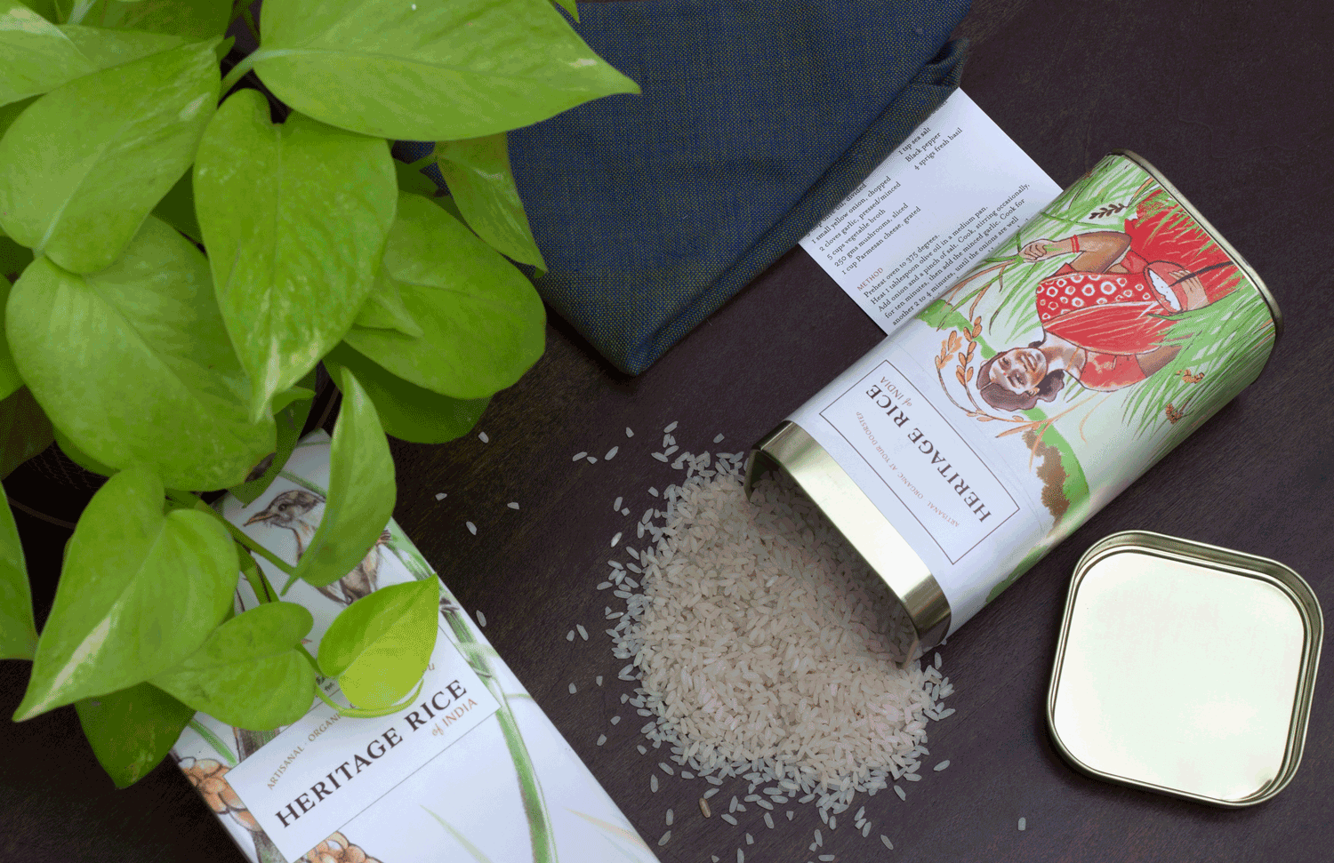
SPIRIT OF THE EARTH
In 2019, I worked on a packaging and identity design project for an organisation working on seed conservation and the cultivation of indigenous rice varieties in rural South India. This project made good use of custom, hand-drawn illustration in the packaging to create a visual language that communicated core values of sustainability, heritage, tradition and healthfulness.
Early process mood-boards—the creation of a colour palette.
Visual research. The use of hand-drawn artwork communicates values like authenticity and trustworthiness.
The label artwork was sketched out by hand, and remains virtually unchanged in the final printed label. The label was designed with sustainability in mind—it would wrap around the tin and needed to be eye catching for in-store display as well.
Side by side comparison of sketch and final label.