Selected Case Studies | Branding & Identity Design
STAGE
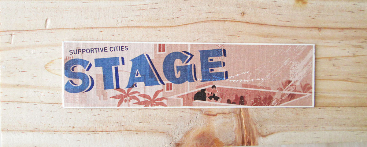
Brand Identity designed for Supportive Cities Stage — an initiative that helps share private spaces to support local artists in Chennai. The hand-lettered logotype is based on painted street signage found in the city, and is especially designed so that distressing and wear and tear of the logo when exposed to natural environmental factors will enhance its appeal.
Fig 1. Real world inspiration
The Inspiration: Urban Typography in and around Chennai City
Indian cities have a long standing tradition of hand painted typography with a unique visual language. Crafted by skilled painters, and hand painted on building exteriors, this unique form of calligraphy is used to signal the public and advertise a range of informal and formal businesses—from tea vendors and carts to small street facing shops and restaurants across commercial and industrial uses. The initiative, Stage also hoped to signal to the public and call attention to its events via the use of posters, and a visually catchy identity that was inspired by the city it grew out of was needed.
This signage in question (fig.1) was photographed in the Chintadripet suburb of Chennai city. It’s hard to say what the original text was used for, but the metal signage had been cut and utilised as part of a door frame—adding an unintentional effect of urban collage. Only the ‘G’ and ‘A’ from the original sign was visible, but it was enough for me to take it forward and design a custom, hand drawn identity (fig 2.)
Fig 2. Promotional Bookmark showing the STAGE logo in use
Natural wear and tear of a promotional sticker gives off an authentic weathered feel
Fig 4. Installed signage outside the STAGE event space.
Fig 5. Small stickers and bookmarks were custom giveaways from each event


